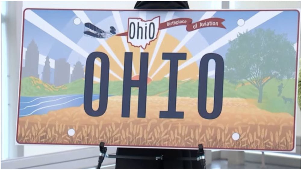
Every few years or so, the state of Ohio redesigns the state license plate.
State license plate designs are honestly a really cool thing. Each state plate has its own unique look. I always find it fun on road trips to gaze at cars on the road and see plates from other states. Typically, they are noticeable because all of the designs are so different.
The current Ohio license plate is simple and clean-looking: a white background with light-blue opaque lettering with words and phrases that represent Ohio, like “Birthplace of Aviation,” “steel,” “river,” “cardinal,” “inventors” and “So Much to Discover,” to name a few. The license plate is complete with a red banner across the top that comes to a point in the middle, reading “Ohio” in a simple and clean font, with the middle of the first “O” being a cut-out of the shape of Ohio. This has been the Ohio Standard license plate since 2013.
This license plate design isn’t anything super spectacular; it doesn’t stick out like crazy, but that’s part of the beauty of it. The simplicity of the design keeps it from sticking out like a sore thumb. Sure, there’s nothing risky about it, but Ohio isn’t quite the land of risks. We stick to what we know, we do what works and we keep from looking stupid because of it.
However, this new license plate does stick out like a sore thumb. It looks silly, and it’s not indicative of Ohio or Ohioans.
It’s clear what the plate is trying to portray; there are different aspects of the state represented here. The urban part of Ohio is represented on the left. The rolling hills of Appalachia stand in the middle ground, with the Ohio River and a wheat field pictured in the foreground. The background is a rising sun; imagery that is very common in American art, common to the point of becoming a cliché. Finally, there is a tree on the right side. A tree, sure, okay. It looks like it could be a buckeye tree – Ohio’s state tree – and there is a child swinging on a tree swing with a dog at their feet. Across the top of the plate is a plane with a banner that reads “Birthplace of Aviation” like the old plate. In front of the banner, slightly off-center, is the Ohio tourism logo, which I personally have never been a fan of. Similar to this license plate, it looks like it was made in Microsoft Paint.
This license plate has too much going on. Yes, there is a lot that Ohio has to offer and it is a diverse state, but that doesn’t necessarily need to be demonstrated on a 12 x 6 inch piece of metal on the back of all our cars. A simpler design like what Ohio has had in the past — and like what several other states opt for — would have been a better move for Ohio’s new license plate.
Mikayla Rochelle is a graduate student studying public administration at Ohio University. Please note that the views and opinions of the columnists do not reflect those of The Post. What are your thoughts? Tell Mikayla by tweeting her at @mikayla_roch.


